
Proposed design implications to owner.com
Proposed design implications to owner.com
FEB/2024
Problem Statement and Approach
As a product designer I have analyzed various websites designed by owner.com, all the elements and images are setup in a structured way in the backend part but some of the designs which should be improved in the front end design to have better emphasis to serving customers which will increase in the business of store.
Problem statement.
Every website is designed in the same frame work.
Active and inactive response of buttons are inconsistent.
Contrast of buttons are vanished in the background.
Menu and Location opens the same page and same position of the page.
Menu section should carry images of all the items .
Reserving a table redirects to a third party website.
Solutions approach.
website design can be improved by creating unique button components.
Contrast of button can be improved with adding hover effect to the buttons.
Adding some contrast to the buttons can also be done.
Adding of jpeg images could make the website more smooth to operate.
Reserving a table can be done by creating new design so that customer can book table from the website itself.
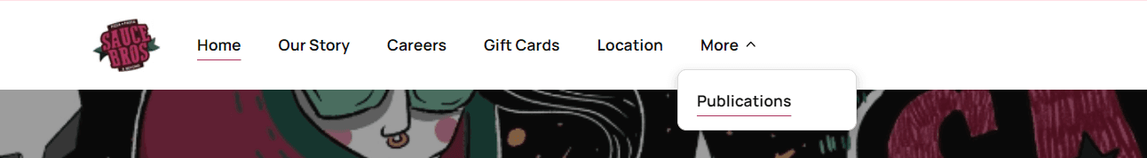
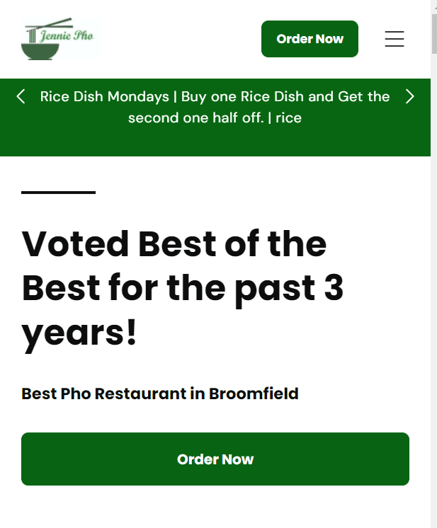
Active and inactive states of buttons are not designed properly.
They are showing the same active state in two buttons at same instance.
Buttons like menu and location do not appear as an active state after clicking.
Our story button has no page in it, reduces trust.
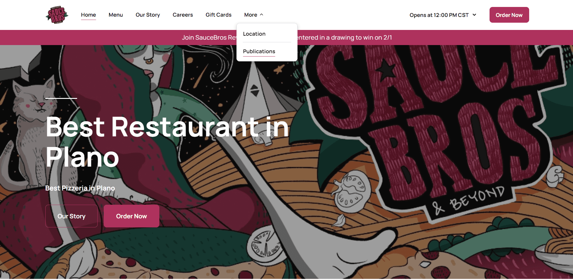
Low visual contrast button which hides in the background.
It can be improved by adding some hover effect or increasing the button contrast.
Redirect to Google chrome, which decreases the trust of customers.
Can be repalced by the changing
There is about section of saucebropizza.com but no story section of it.
Click
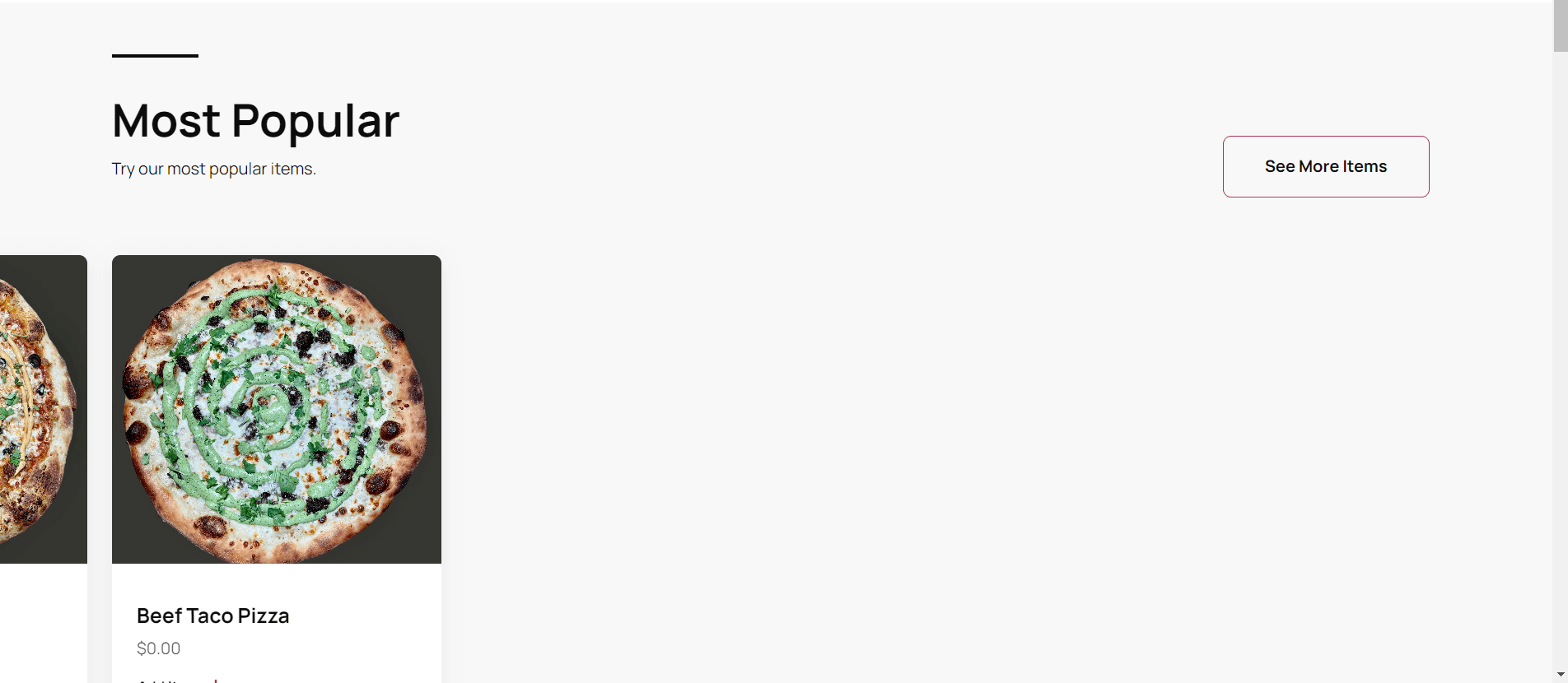
Sliding left vanishes other items and if there are three items there is no need of slide.
Lot of empty spaces means lack of information reduces trust in the customers.
It can be improved by creating slider button so that the customer get info about scrolling through items.
There is no price showing for the items in the first place.
Discontinuance of Halo’s Effect (wrong info breaks trust too).
Minimum price can increase the chance of buying as per Decoy’s effect.
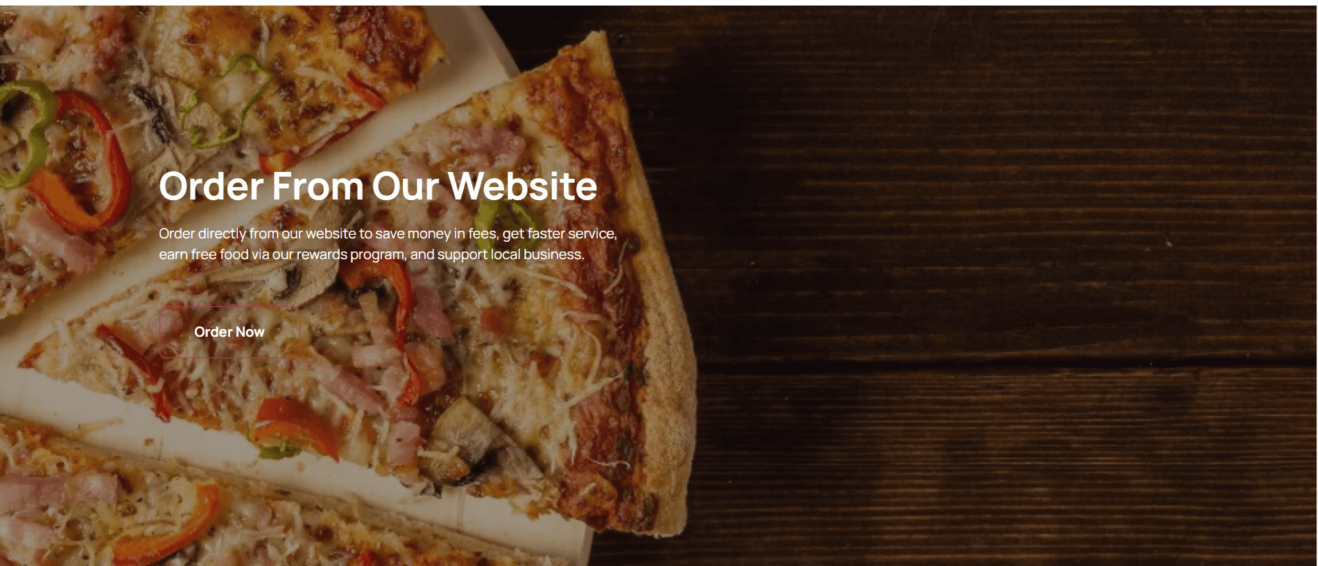
Visual contrast of order now button vanishes in the background.
There is no symmetry with back ground and the syllable, enough empty space on right side
This can be improved by horizontal flipping the image and increasing the button contrast or we can add hover effect to the button
Even the logo can also be improved by removing the white background of the logo.

Sliding left vanishes other items and if there are three items there is no need of slide.
Lot of empty spaces means lack of information reduces trust in the customers.
It can be improved by creating slider button so that the customer get info about scrolling through items.
Add item hover effect can be improved as it shows the full line in the item card section.

Contrast of order now button vanishes in the back ground and it can be improved adding some hover effect.
Or we can increase the button contrast.
Slider left and right are not aligned to the center of the container.
Not responsive in mobile and tab.
Disturbs symmetry.
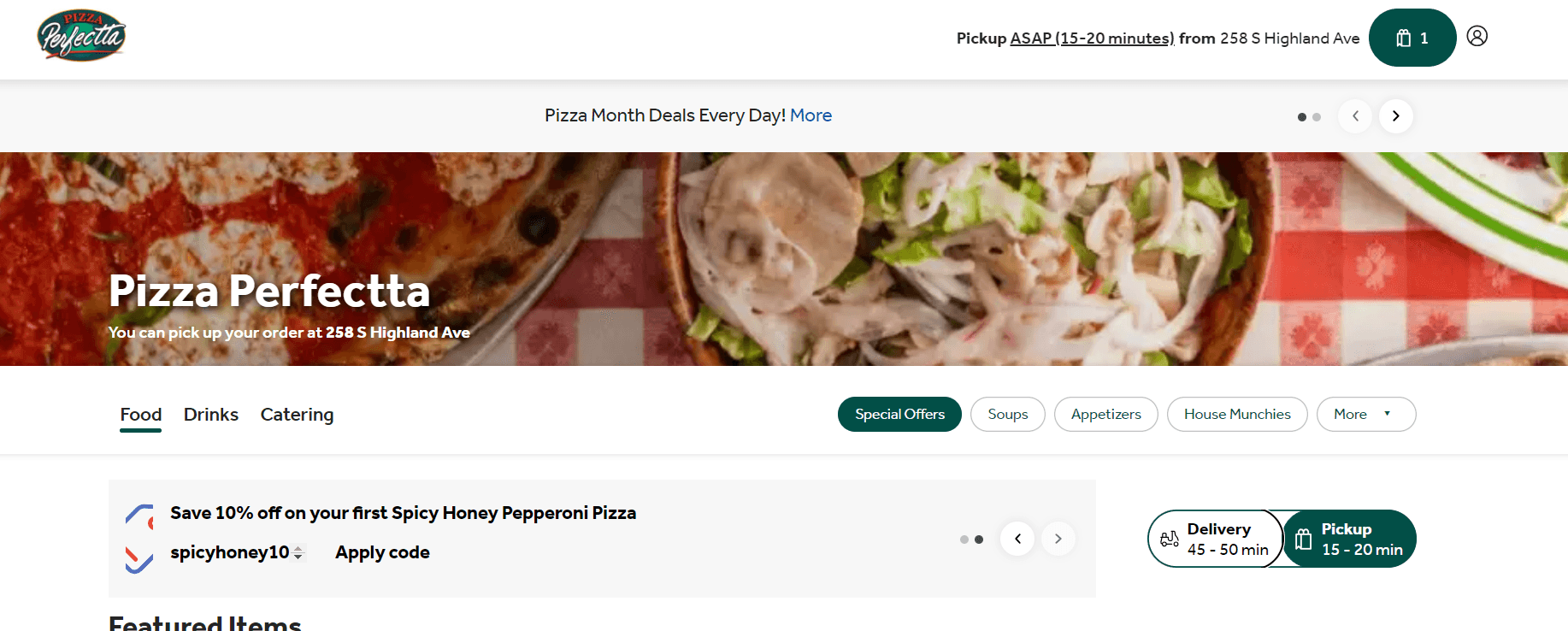
This button jangling can be improved by creating a separate component for this option.
By clicking on the logo it do not redirect to the homepage
These two can be shifted in one rail to increase some empty space iin the tab.
These options are set manual, requires effort to check offers.
Automation of these options with rails can reduce effort and more conversion.
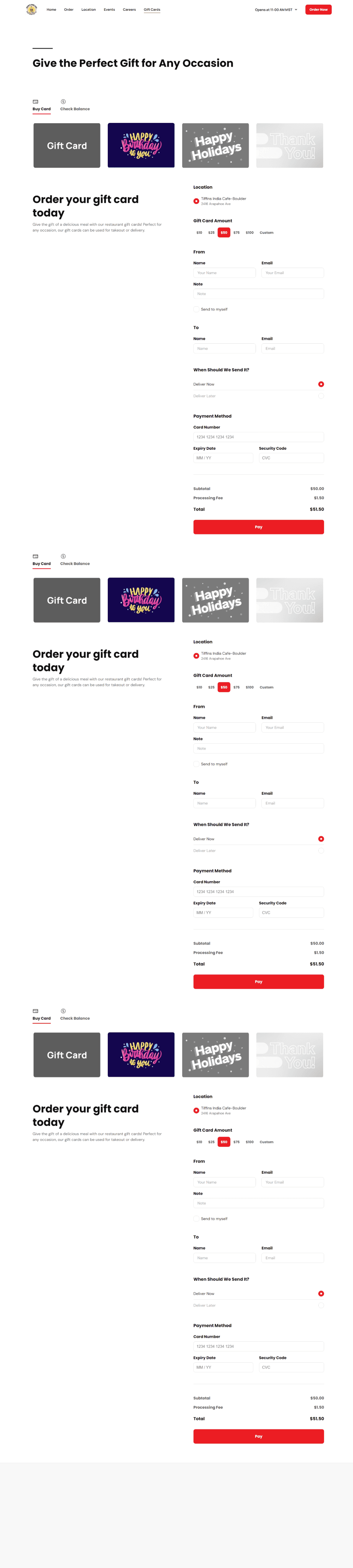
Most of the food item do not have images
Order section is repeating itself.
Event section repeating itself.
Gift card section repeating itself.
Repeating increases cognitive load to the customers.
Create confusion to the customers.
5/5


Shrunk in tabular form to cover space
Shrunk in tabular form to cover space
These designs implications are proposed in feb/2024.