O ONE

coffee
Serving coffee
Straight forward
coffee
O ONE
Serving coffee
Straight forward
Name, Strategy and Brand experience to launch a new coffee brand to the market.
Built on truth and trust from customer experience.
Visual identity ignites the elements of drinking experience.
Background
It all started by selling packaged coffee to local general stores, and it got a boom. They have good quality coffee and it is packaged in conical cups. But they don’t have any packaging and brand name to create a unique persona in the market.
When I got the opportunity to work on this project, I decided to design a unique brand name and the packaging design to create insightful impact to their customers.

coffee
Naming
As I am a coffee person too, I think coffee is a very important element in our daily lives. Like before starting your day or after having a hectic day we need a coffee.
Like the air we breath the coffee we drink it ignites our hormones to kickstart the day.
I came up with the name of O ONE, similar like O2 which we breath in.
And O ONE can be created into an element form to portray a picture of an important element in our lives.
OONE is a very important element that exists in periodic table of a human being.
While in a shop, you know what to order “ O ONE COFFEE PLEASE!”
Imagine your day one can become O ONE day.
While clearing your daily hurdles, O ONE can be you GO OONE.
So, O ONE is a easy and enjoyable name.
While I was creating O ONE type letter I have used gestalt’s principle to create a unique word which is eye catchy and easy to pronounce at the same time.


go
Day
Day one

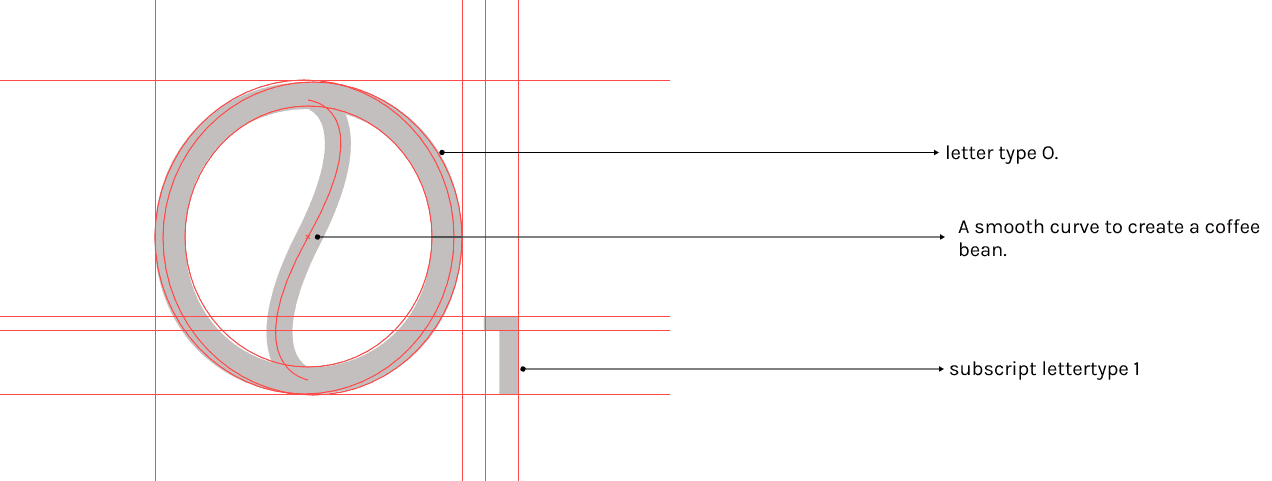
Logotype Design
After choosing the name a new logotype is needed to create a bold shadow among the market and make it stand out of the context.
I decided to design a new logo in an elemental form which should be simple and aesthetic at the same time.


A smooth curve to create a coffee bean.
letter type O.
subscript lettertype 1
Oxford Blue
White
Black
161D38
FFFFFF
060606
Color Pallete
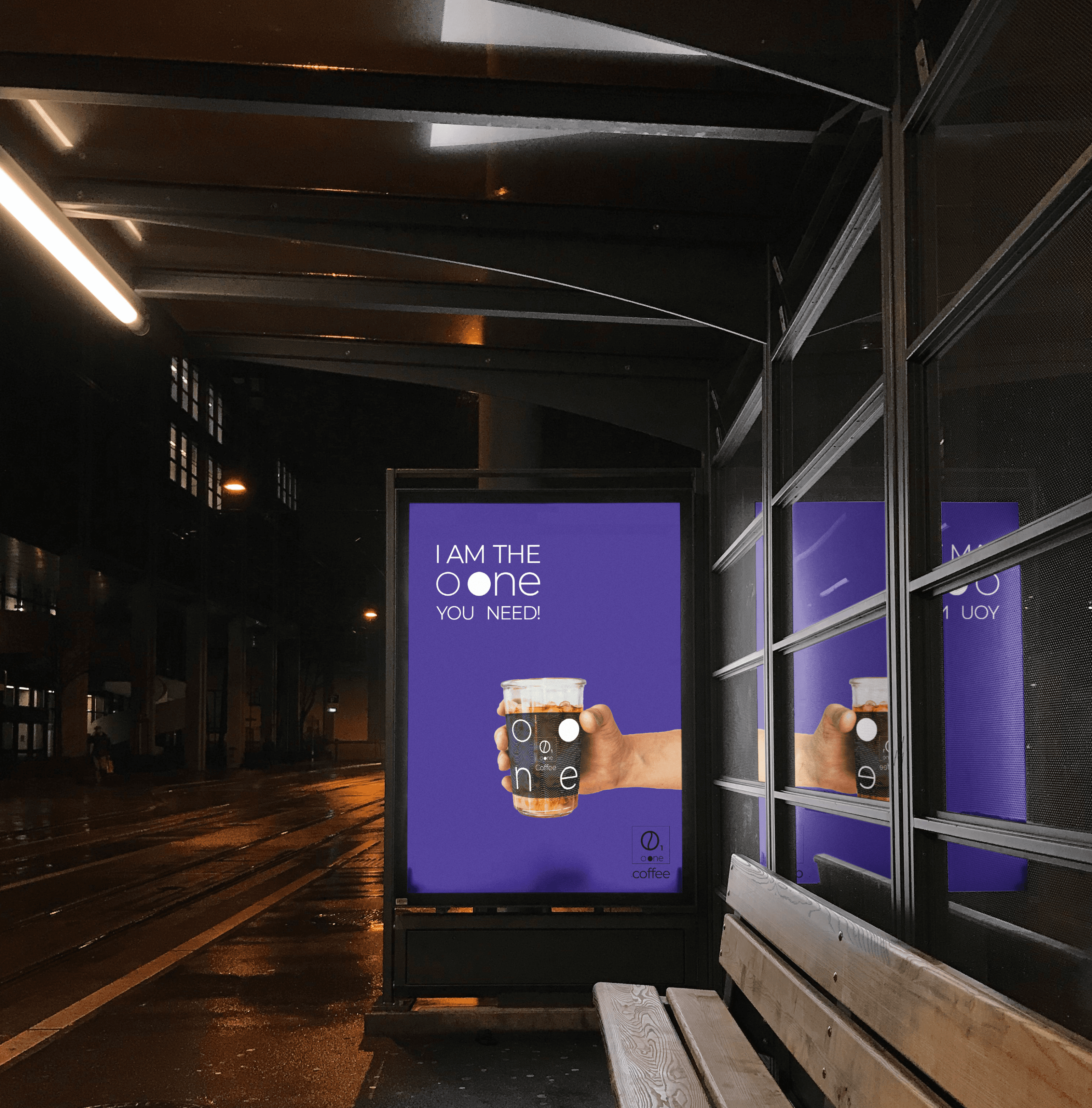
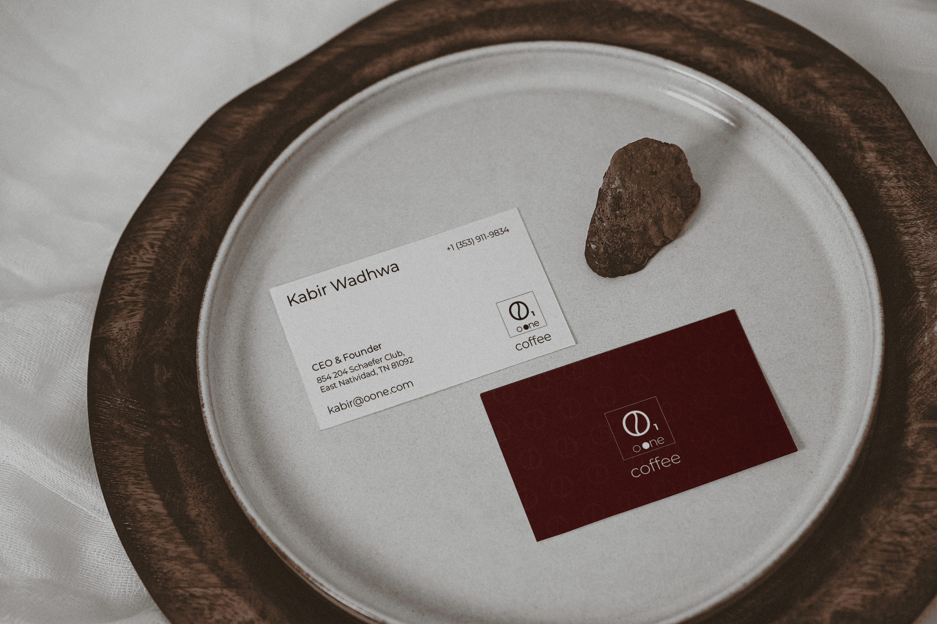
Visual Identity
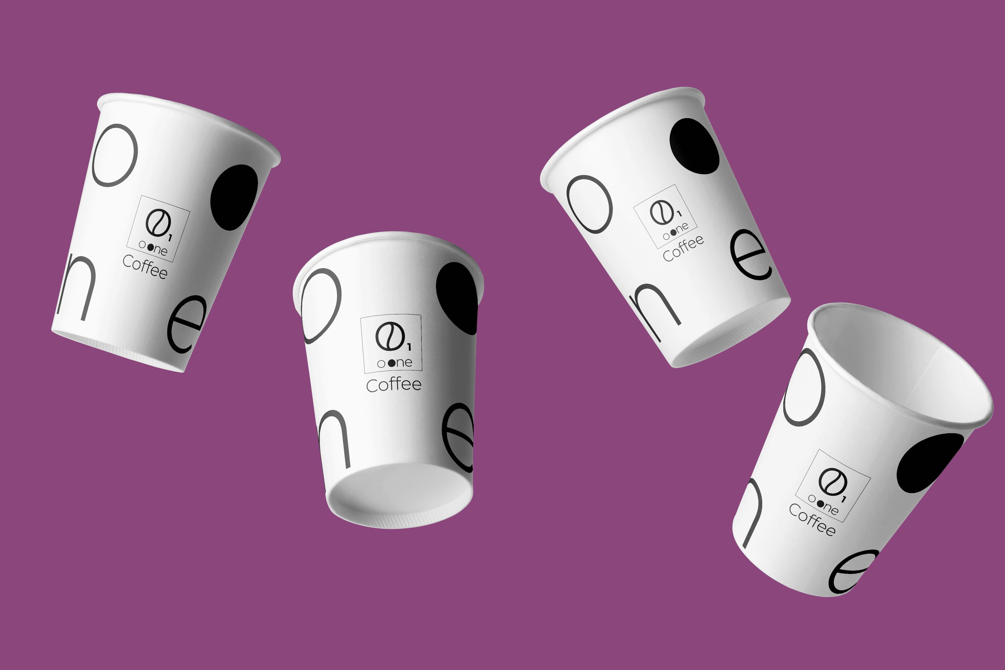
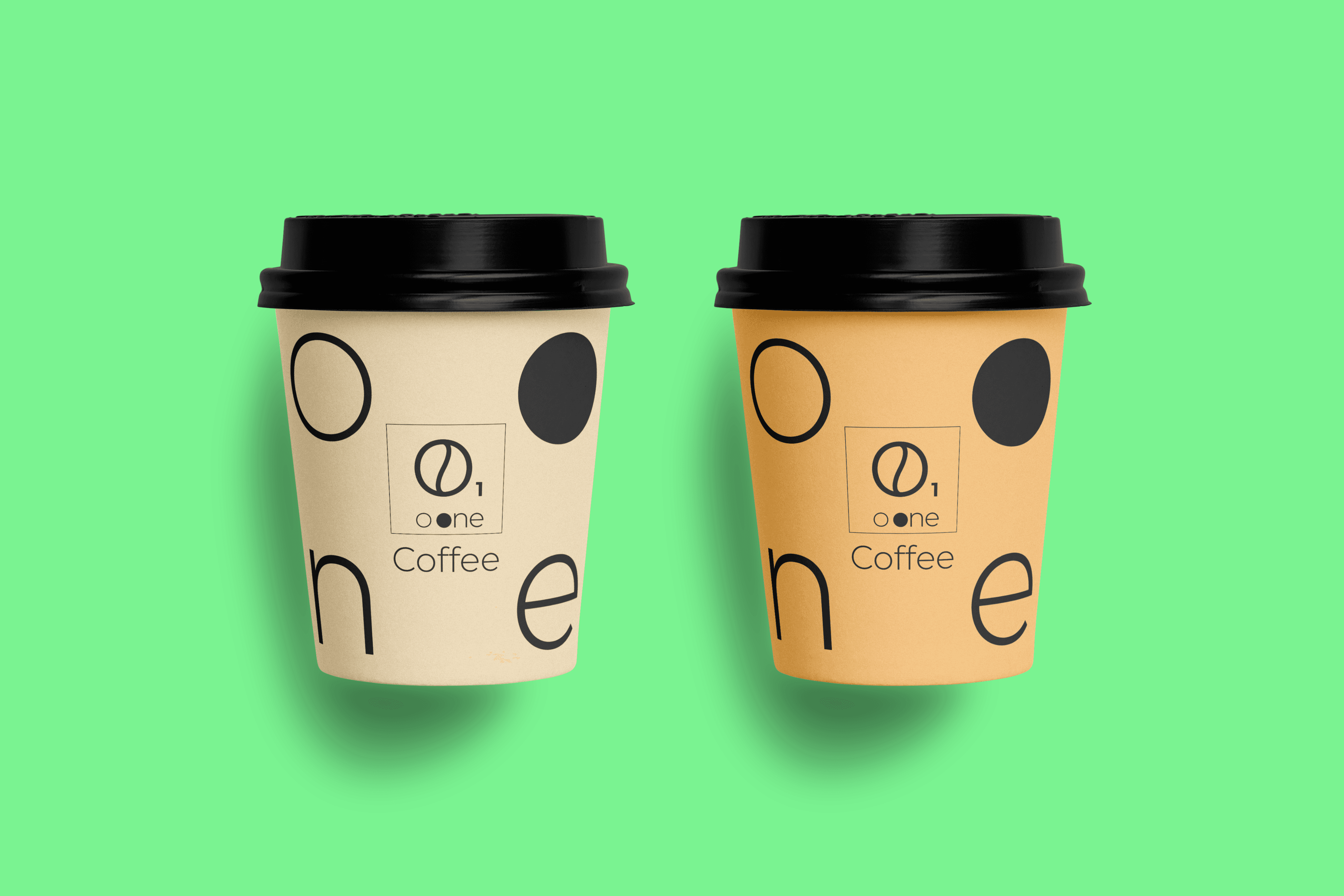
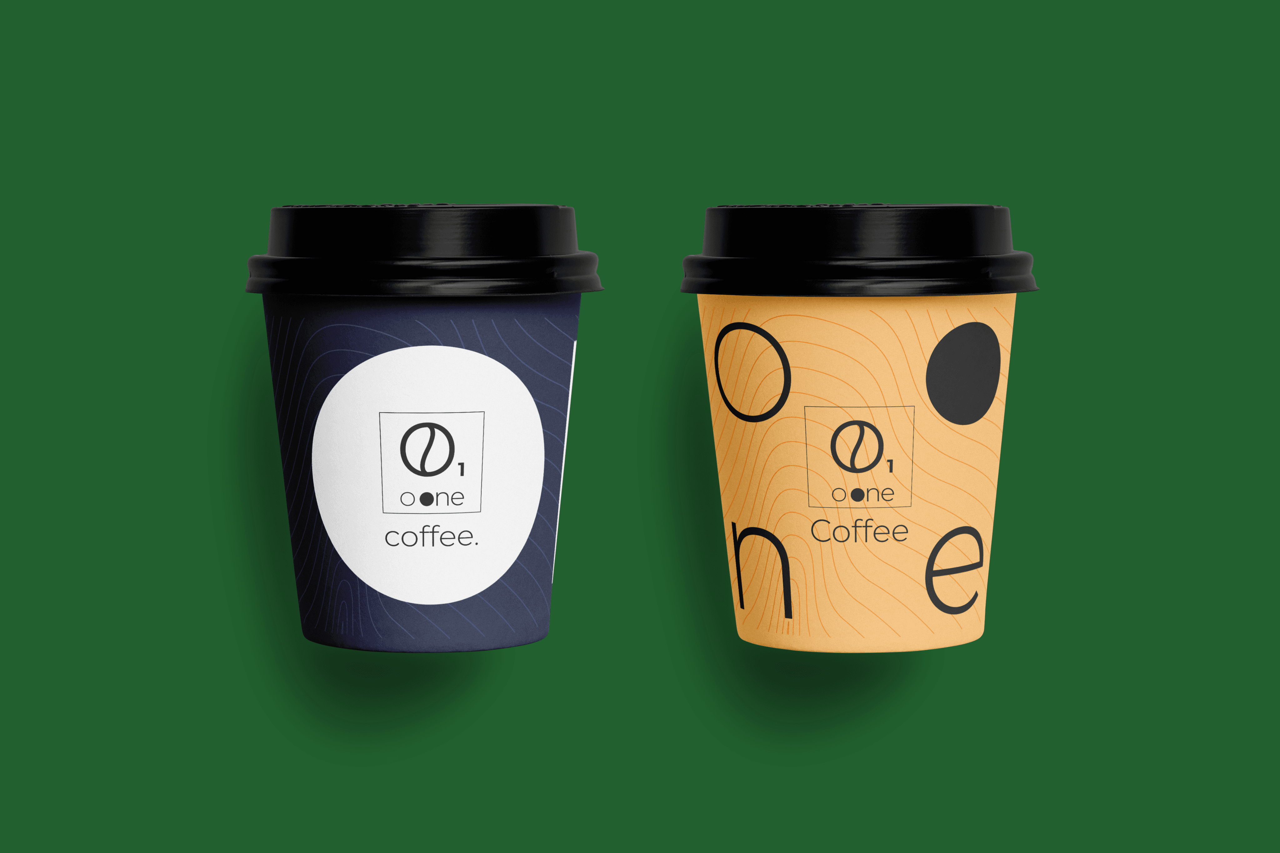
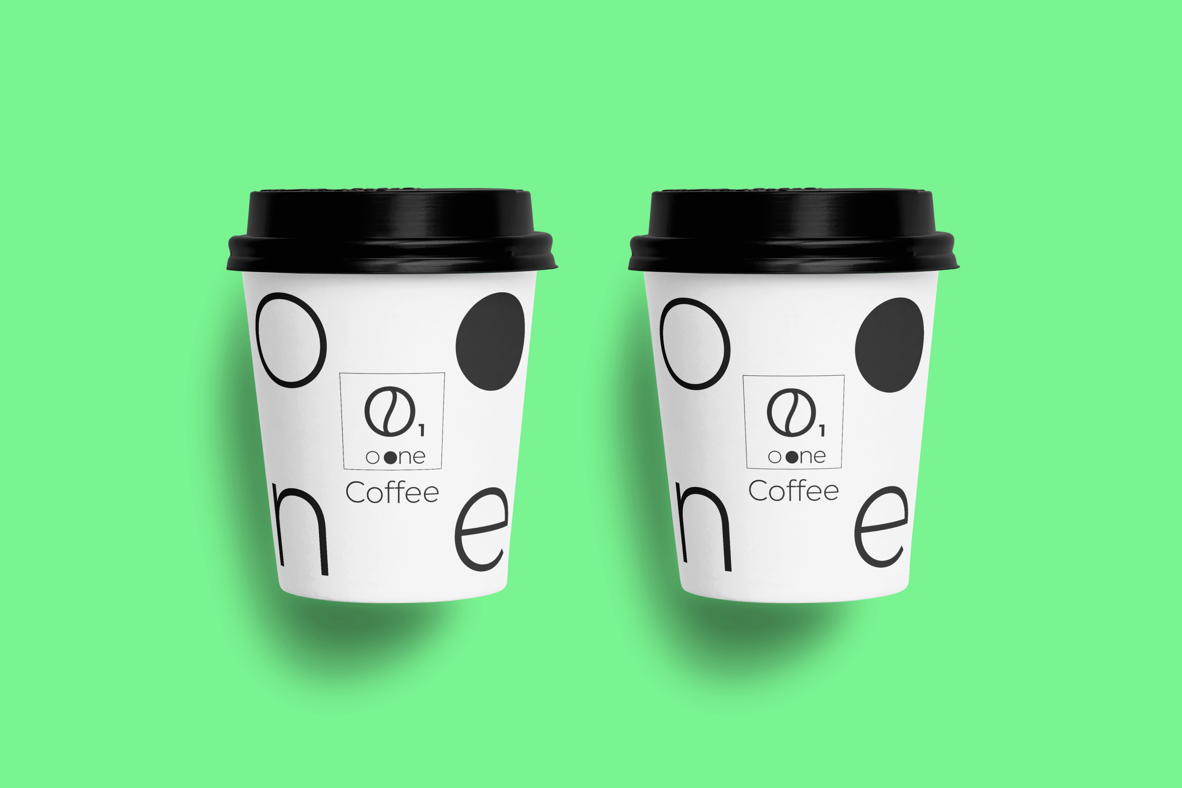
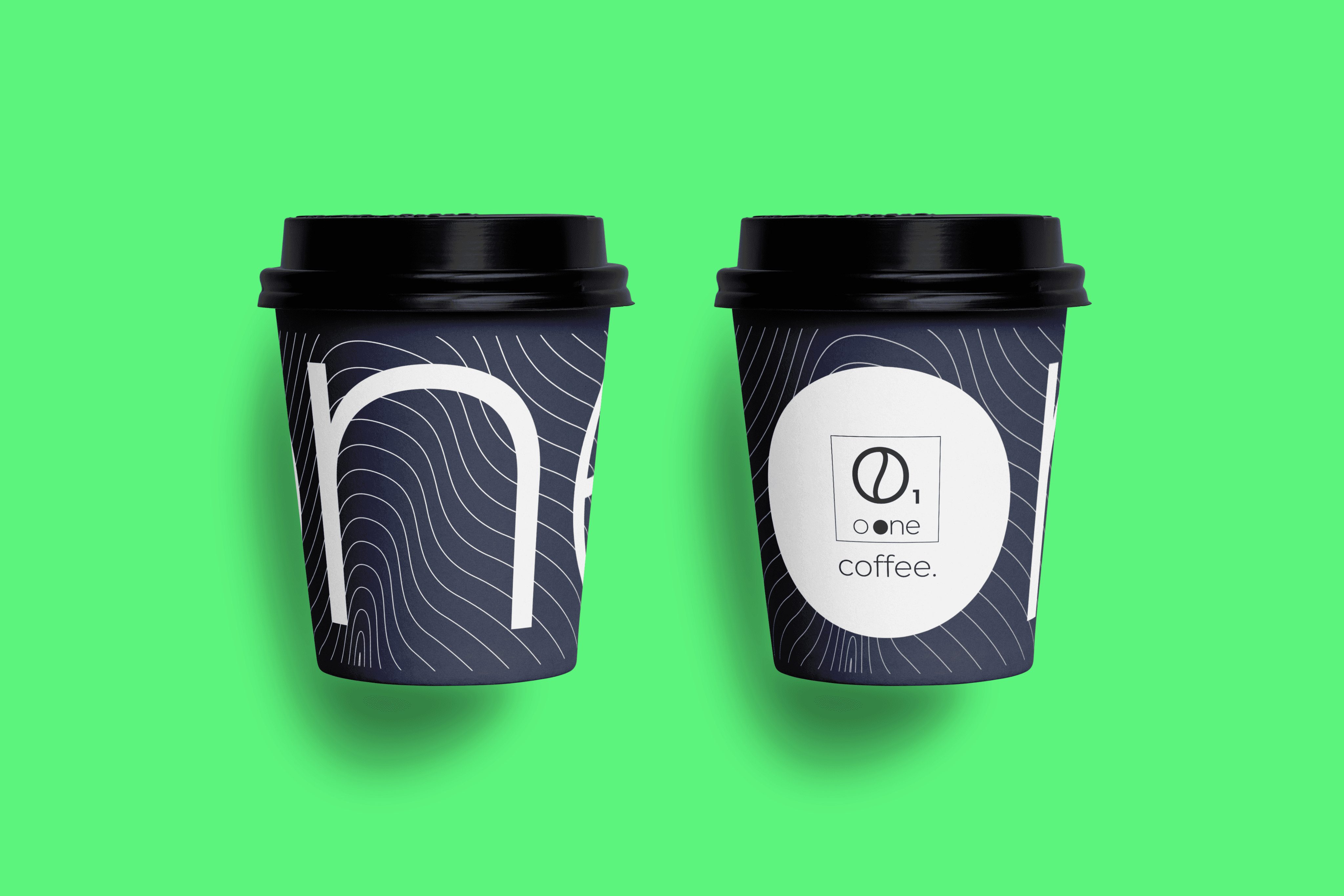
For the launch of their upcoming products they need a new packaging, So I decided to design some business card mockup and packaging design to move further.


O ONE
coffee
Serving coffee
Straight forward
Name, Strategy and Brand experience to launch a new coffee brand to the market.
Built on truth and trust from customer experience.
Visual identity ignites the elements of drinking experience.
coffee
Naming
As I am a coffee person too, I think coffee is a very important element in our daily lives. Like before starting your day or after having a hectic day we need a coffee.
Like the air we breath the coffee we drink it ignites our hormones to kickstart the day.
I came up with the name of O ONE, similar like O2 which we breath in.
And O ONE can be created into an element form to portray a picture of an important element in our lives.
OONE is a very important element that exists in periodic table of a human being.
While in a shop, you know what to order “ O ONE COFFEE PLEASE!”
Imagine your day one can become O ONE day.
While clearing your daily hurdles, O ONE can be you GO OONE.
So, O ONE is a easy and enjoyable name.
While I was creating O ONE type letter I have used gestalt’s principle to create a unique word which is eye catchy and easy to pronounce at the same time.


Logotype Design
After choosing the name a new logotype is needed to create a bold shadow among the market and make it stand out of the context.
I decided to design a new logo in an elemental form which should be simple and aesthetic at the same time.
Visual Identity
For the launch of their upcoming products they need a new packaging, So I decided to design some business card mockup and packaging design to move further.
Name, Strategy and Brand experience to launch a new coffee brand to the market.
Name, Strategy and Brand experience to launch a new coffee brand to the market.
Built on truth and trust from customer experience.
Built on truth and trust from customer experience.
Visual identity ignites the elements of drinking experience.
Visual identity ignites the elements of drinking experience.
Background
It all started by selling packaged coffee to local general stores, and it got a boom. They have good quality coffee and it is packaged in conical cups. But they don’t have any packaging and brand name to create a unique persona in the market.
When I got the opportunity to work on this project, I decided to design a unique brand name and the packaging design to create insightful impact to their customers.
coffee
coffee
Naming
As I am a coffee person too, I think coffee is a very important element in our daily lives. Like before starting your day or after having a hectic day we need a coffee.
Like the air we breath the coffee we drink it ignites our hormones to kickstart the day.
I came up with the name of O ONE, similar like O2 which we breath in.
And O ONE can be created into an element form to portray a picture of an important element in our lives.
OONE is a very important element that exists in periodic table of a human being.
While in a shop, you know what to order “ O ONE COFFEE PLEASE!”
Imagine your day one can become O ONE day.
While clearing your daily hurdles, O ONE can be you GO OONE.
So, O ONE is a easy and enjoyable name.
While I was creating O ONE type letter I have used gestalt’s principle to create a unique word which is eye catchy and easy to pronounce at the same time.
Visual Identity
For the launch of their upcoming products they need a new packaging, So I decided to design some business card mockup and packaging design to move further.
Rotate your phone to landscape mode