
Background
At locer they build minimalistic and user centric applications for their consumers, which not only provides online shopping experience but it also makes people’ life easy.
For shopkeepers they provide platform to setup their store and list products, along with they can also manage their sales and schedule of thier respective shops.
For customers, they can buy online groceries from their local stores, with minimum acquisition cost, and they get a variety of stores to shop from.

Think of a place where you can buy grocery online and that to from your local store. Well, at locer they build application for shopkeepers to manage their inventory and reach socially to their customer. And a customer get a wide range of shops to choose from.
So, they needed a website which should speaks about the company and also creates a bold impact.
Challenge
Outcome
Strategy
Web Design
Messaging
locer
online platform for local stores.
Scope of project
A strategic rebrand- messaging, website and collaterals- not only creates a social impact but, the innovators for local shopping. The website design came out to be smooth and informative.
Background
At locer they build minimalistic and user centric applications for their consumers, which not only provides online shopping experience but it also makes people’ life easy.
For shopkeepers they provide platform to setup their store and list products, along with they can also manage their sales and schedule of thier respective shops.
For customers, they can buy online groceries from their local stores, with minimum acquisition cost, and they get a variety of stores to shop from.

Strategy
After a brief conversation with the founder, we decided to create a unique persona in the market and it should be eyecatchy and should create a remembrance impact to their customers.
I came up with taglines , Shop on locer, from your closer and it totally fits into rhythm and also sends an impactful message.
After few months of working with them I got in-depth idea of what they are trying to solve and primarily I decided to create a website and tagline to create an online presence.
Shop on locer, from your closer.


Design
Before diving into design I have to know their customers, in the end output is going to serve them. I discovered that I have to be empathetic towards their customers.
I decided to design a website which should be bold and informative and the customers should get all the queries cleared in the first glance.
INFORMATIVE
CONFIDENT
BOLD
GENUINE
SMOOTH
COST
SAVING
COLLABORATION LEADS INNOVATION
primary
33A852
tertiary
000000
secondary
2D2E87
Typography : Poppins
What makes Poppins unique is that it supports both Latin and Devanagari writing systems, making it usable for a wider range of languages. And its symmetrical design not only creates a smooth experience but it makes itself to stand out of drama.
A B C D E F G H I J K L M N O P Q R S T U V W X Y Z
A B C D E F G H I J K L M N O P Q R S T U V W X Y Z
1 2 3 4 5 6 7 8 9 0 $ @ # %
Color pallete
Design structure
After we finalize the color pallets and typography, now its time to decide the pages and content that are going to be in the website.
After all the atoms are ready, we are ready to create a new element that is goin to serve their customers.
After a lot of iterations I decided to go with three pages - homepage, business, about us along with basic terms and privacy pages. I have designed the basic design structure and then converted into a final design.
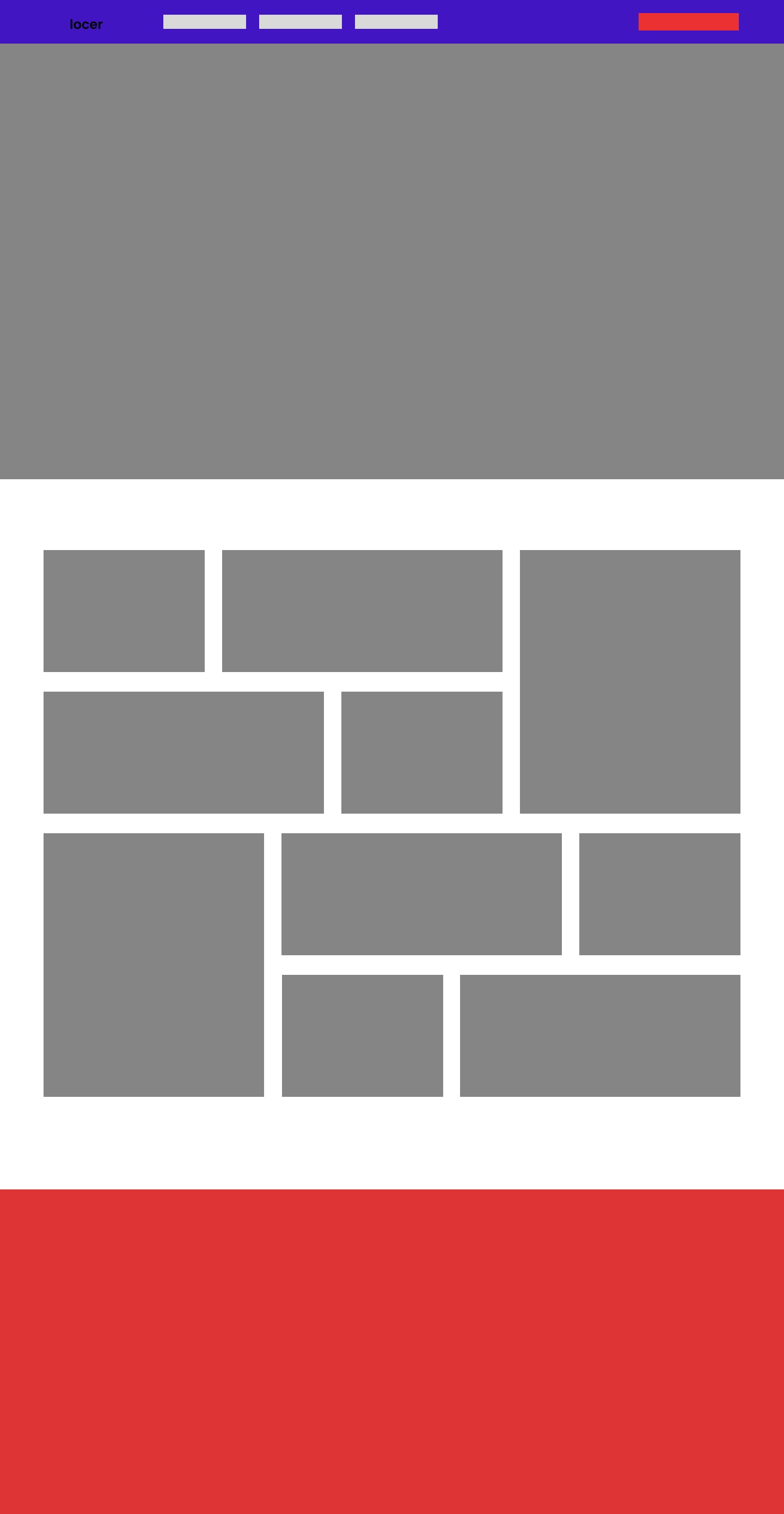
Wireframe


Final design
SHOP ON
LOCER
FROM
YOUR
CLOSER
SHOP ON
LOCER
FROM
YOUR
CLOSER
SHOP ON
LOCER
FROM
YOUR
CLOSER
SHOP ON
LOCER
FROM
YOUR
CLOSER
SHOP ON
LOCER
FROM
YOUR
CLOSER


desktop view
mobile view
Take a tour
Take a tour
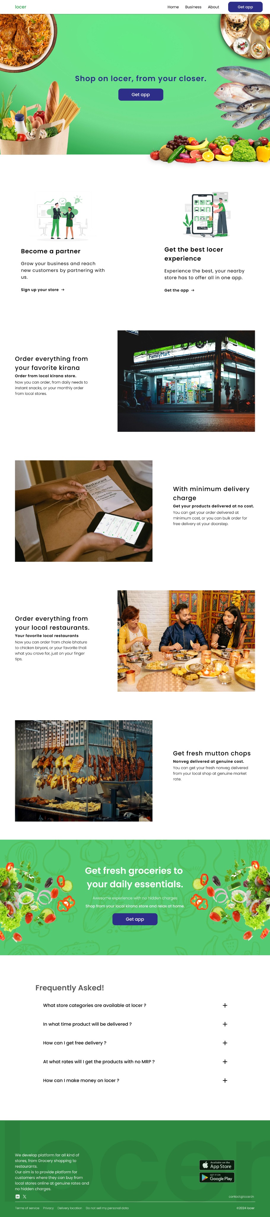
Final design mockup
Webpage presentation
you can check the website @ www.locer.in
locer
online platform for local stores.
Strategy
Web Design
Messaging
Scope of project
Challenge
Think of a place where you can buy grocery online and that to from your local store. Well, at locer they build application for shopkeepers to manage their inventory and reach socially to their customer. And a customer get a wide range of shops to choose from.
So, they needed a website which should speaks about the company and also creates a bold impact.
Outcome
A strategic rebrand- messaging, website and collaterals- not only creates a social impact but, the innovators for local shopping. The website design came out to be smooth and informative.
Background
At locer they build minimalistic and user centric applications for their consumers, which not only provides online shopping experience but it also makes people’ life easy.
For shopkeepers they provide platform to setup their store and list products, along with they can also manage their sales and schedule of thier respective shops.
For customers, they can buy online groceries from their local stores, with minimum acquisition cost, and they get a variety of stores to shop from.
After a brief conversation with the founder, we decided to create a unique persona in the market and it should be eyecatchy and should create a remembrance impact to their customers.
I came up with taglines , Shop on locer, from your closer and it totally fits into rhythm and also sends an impactful message.
After few months of working with them I got in-depth idea of what they are trying to solve and primarily I decided to create a website and tagline to create an online presence.
Strategy

Before diving into design I have to know their customers, in the end output is going to serve them. I discovered that I have to be empathetic towards their customers.
I decided to design a website which should be bold and informative and the customers should get all the queries cleared in the first glance.
Design
BOLD
CONFIDENT
INFORMATIVE
COST
SAVING
SMOOTH
GENUINE
COLLABORATION LEADS INNOVATION
Typography : Poppins
What makes Poppins unique is that it supports both Latin and Devanagari writing systems, making it usable for a wider range of languages. And its symmetrical design not only creates a smooth experience but it makes itself to stand out of drama.
A B C D E F G H I J K L M N O P Q R S T U V W X Y Z
A B C D E F G H I J K L M N O P Q R S T U V W X Y Z
1 2 3 4 5 6 7 8 9 0 $ @ # %
Color pallete
primary
33A852
secondary
2D2E87
tertiary
000000
After we finalize the color pallets and typography, now its time to decide the pages and content that are going to be in the website.
After all the atoms are ready, we are ready to create a new element that is goin to serve their customers.
After a lot of iterations I decided to go with three pages - homepage, business, about us along with basic terms and privacy pages. I have designed the basic design structure and then converted into a final design.
Design structure
desktop view
mobile view
Final design mockup
Webpage presentation
Take a tour
You can check website @www.locer.in
desktop view
mobile view
Final design mockup
Webpage presentation
Take a tour
You can check website @www.locer.in
Wireframe
SHOP ON
LOCER
FROM
YOUR
CLOSER
SHOP ON
LOCER
FROM
YOUR
CLOSER
SHOP ON
LOCER
FROM
YOUR
CLOSER
SHOP ON
LOCER
FROM
YOUR
CLOSER
SHOP ON
LOCER
FROM
YOUR
CLOSER
Final Design
After a brief conversation with the founder, we decided to create a unique persona in the market and it should be eyecatchy and should create a remembrance impact to their customers.
I came up with taglines , Shop on locer, from your closer and it totally fits into rhythm and also sends an impactful message.
After few months of working with them I got in-depth idea of what they are trying to solve and primarily I decided to create a website and tagline to create an online presence.
Strategy
Design
Before diving into design I have to know their customers, in the end output is going to serve them. I discovered that I have to be empathetic towards their customers.
I decided to design a website which should be bold and informative and the customers should get all the queries cleared in the first glance.

Typography : Poppins
What makes Poppins unique is that it supports both Latin and Devanagari writing systems, making it usable for a wider range of languages. And its symmetrical design not only creates a smooth experience but it makes itself to stand out of drama.
A B C D E F G H I J K L M N O P Q R S T U V W X Y Z 1 2 3 4 5 6 7 8 9 0 $ @ # %
Design
structure
After we finalize the color pallets and typography, now its time to decide the pages and content that are going to be in the website.
After all the atoms are ready, we are ready to create a new element that is goin to serve their customers.
After a lot of iterations I decided to go with three pages - homepage, business, about us along with basic terms and privacy pages. I have designed the basic design structure and then converted into a final design.
Final design
